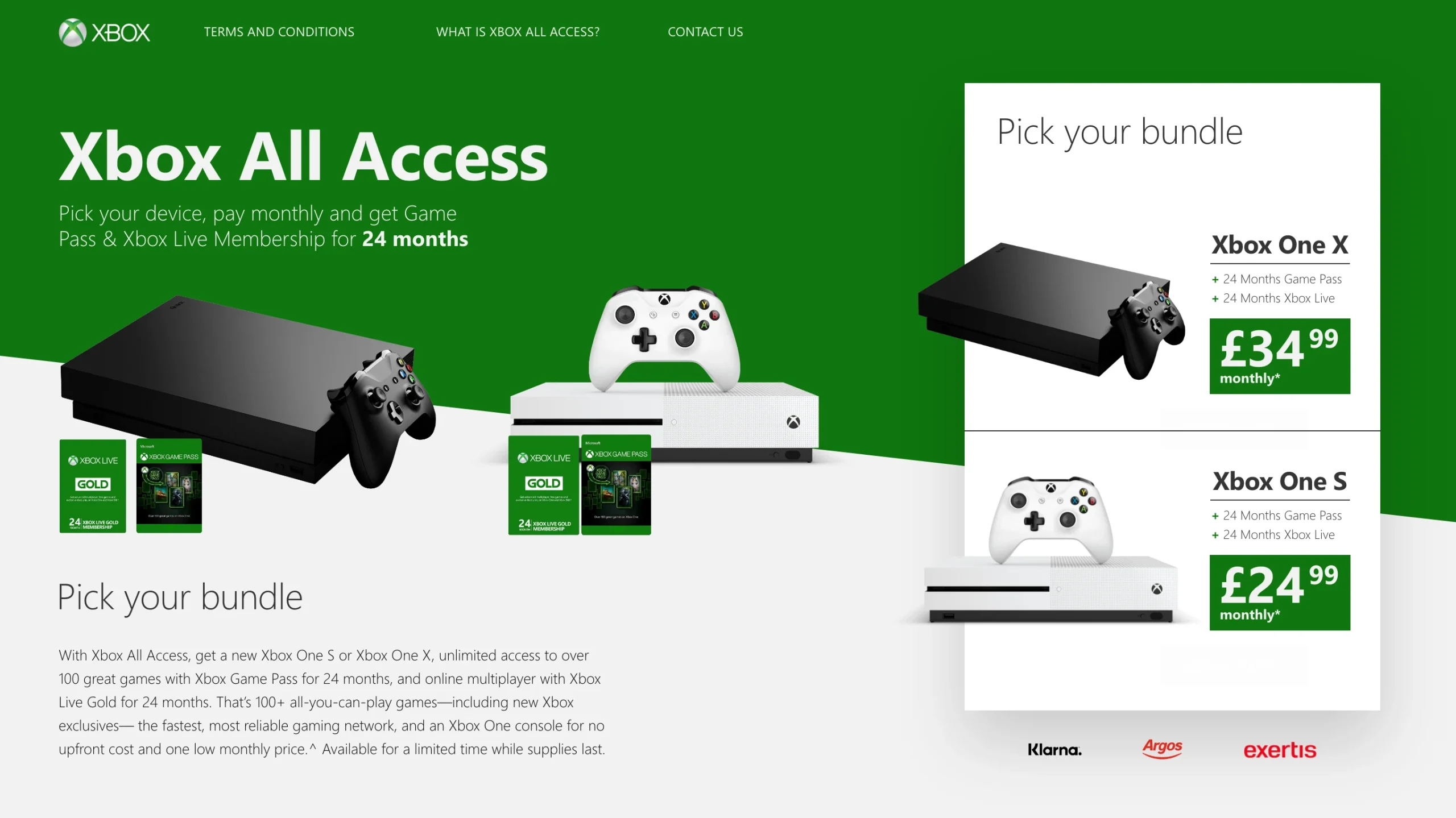
This was a high-stakes product launch built around a deceptively simple idea: what if you could get an Xbox the same way you get a phone? No upfront payment, no separate subscriptions, just one monthly cost that bundled the console and 36 months of Xbox Game Pass Ultimate.
We were building the official Xbox All Access portal for Exertis, the UK distributor managing logistics and fulfilment. Klarna handled payments and credit checks, Argos was the retail face, and Microsoft was, well, in charge of Xbox and the main stakeholder. It was a four-party collaboration, each with their own priorities and constraints.
As the Exertis side of this, I led the design and development of the portal. That meant crafting a flow that felt effortless and exciting to users, while navigating tight platform limitations, regulatory content, and a tangle of overlapping stakeholder interests. It was equal parts product, UX, development work and diplomacy.
Users landed on the page, picked between an Xbox Series X or S, and completed checkout, all without navigating away. Keeping it single-page was critical. Our audience skewed young, impatient, and impulsive. I wanted them focused, not bouncing between tabs.
The entire flow sat on top of a WordPress/WooCommerce backend, which meant I couldn’t mess with the checkout structure, only embed and style it. Klarna handled the payments, including credit checks and compliance copy. That content was locked down, so I styled around it using Klarna’s theming system (that I had to study extensively) to make it feel native to Xbox.
To keep users engaged, I added small transitions and a dynamic background animation: each step subtly shifted the angled background cut, creating a sense of motion without slowing anything down. The console selector also morphed in-place, instead of taking users to a new page, the interface dynamically transformed based on their pick. It felt responsive and just, cool, which was the point.
What went wrong
For three months, I ran a weekly call including every partner. Microsoft people were always there, never said a word, and I (foolishly) took that as a non-issue. You know the type, is in every meeting, never says a word except “have a good weekend all!”. After building and testing the whole thing, they pulled the plug in a simple email: something like, “This should never have had Xbox branding.” Just like that, it was dead.
What I took away
Silence does not always mean approval. Now, I make a point of isolating the quietest stakeholder and forcing a conversation early. That one lesson has saved me multiple times since, including on the Veolia redesign.