ORIN is a reservations platform built for small hospitality businesses like restaurants and bars.
Designed to feel as simple as a consumer app, ORIN gives owners and staff visibility and control over their reservations, payments, AI-assisted messaging, multi-user management, and scheduling logic with a mobile-first interface. It includes an iOS & web dashboard for restaurants, and a web widget for customers, a complete end-to-end solution that fits neatly into their existing websites. Most our users are independents or family-run shops. Busy, understaffed, and constantly adapting. They need something that just works, and looks sharp doing it.
I co-founded ORIN in 2024 and led the product strategy, design, and front-end development from day one.
With limited resources and no room to delegate, I had to wear every hat, from research to UX to the actual front-end build. I set up the core foundations, shaped the product direction, and built a scalable design system around it. As the product matured, I started scaling the design and engineering team, and mentored new contributors to take over feature work with consistency and confidence. This case study focuses on that early phase: how I built a tool that feels simple on the surface but handles real-world complexity without overwhelming the people using it.
Discovery
I was quite lucky in terms of discovery. I did it before we officially kicked off the project. It wasn’t just about product design at that point; it was about figuring out if this was a business worth building, and how we could actually stand out in a crowded market. So I took my time. For about three months, I ran interviews and observations with restaurant owners, managers, and waitstaff. Many of them as they actively worked servicing the floor. I watched how they handled reservations (or didn’t), what tools they used, where things broke down, and what they cared about more than they let on.
- Interviews & Observations: Did 50+ detailed interviews across 20 diverse hospitality businesses, covering various cuisines, locations, and sizes. Spent more than five full days simply observing operations during service hours.
- Competitive Research: Extensively tested competitor tools, attending sales pitches and product walkthroughs. Also evaluated multiple online appointment platforms for transferable insights.
As early ideas started to take shape, I kept a notebook with quick wireframes to test people’s instincts. I’d sketch out a screen and ask where they’d tap, or what they thought would happen next. Not as formal testing, but to surface gut reactions and get a sense of their mental models. It helped me refine structure and language before anything was built.
Key Insights
- Most of our future users weren’t sitting at a desk, they were constantly moving around in their shops, distracted, often mid-shift, and just needed to know what was happening in the next hour or two.
- Tablet and phone parity was rare in competing tools.
- Visual design wasn’t just “nice to have”. It signalled legitimacy, especially in front-of-house situations where customers could see the screen.
- Some staff lacked confidence writing messages in English.
- Some shops had no system at all. They were still using paper notebooks.
- Nearly everyone complained about no-shows, but customers had a strong aversion to providing card details.
- Staff turnover was high, which made long-term training, team logins, and continuity a recurring problem.
These findings shaped the product from day one. We designed for mobile and tablet equally. We prioritised clarity over configurability. Features could stay hidden if they were easy to find again. We built visual polish into the core product, not the surface layer. We structured user accounts to be portable between shops. And we built the whole system with the assumption that attention was limited, wifi might be spotty, and training wasn’t an option.
Key Personas
Martin Blake, 56
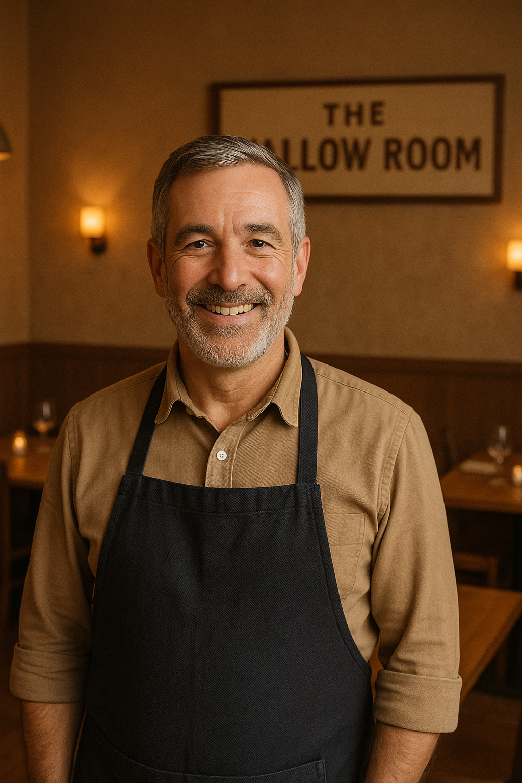
Owner of The Tallow Room, a small bistro in a UK town
- Martin runs The Tallow Room with his wife and daughter. It has just 7 tables. Intimate and personal. Always in demand.
- He doesn’t have a website. No social media. Bookings come in by phone, then get jotted into a paper notebook that lives behind the bar.
- On busy nights or holidays, things slip. Someone forgets to note down a booking, or they overbook because the notebook wasn’t updated.
- Martin isn’t anti-tech (so he says). He’s just wary of anything that feels fiddly or like it’ll break his flow. He’s proud of the personal experience he offers and doesn’t want a “system” to get in the way.
- At the same time, he knows younger guests are avoiding phone calls. He’s quietly aware they might be going elsewhere.
Martin needs a system so simple it feels like pen and paper. Fast to glance at, impossible to mess up, and manageable in one or two taps.
He’s fine letting his daughter handle setup or tweaks, but he wants to see today’s bookings without navigating menus or worrying he’ll delete something by mistake.
Leyla Demir, 33
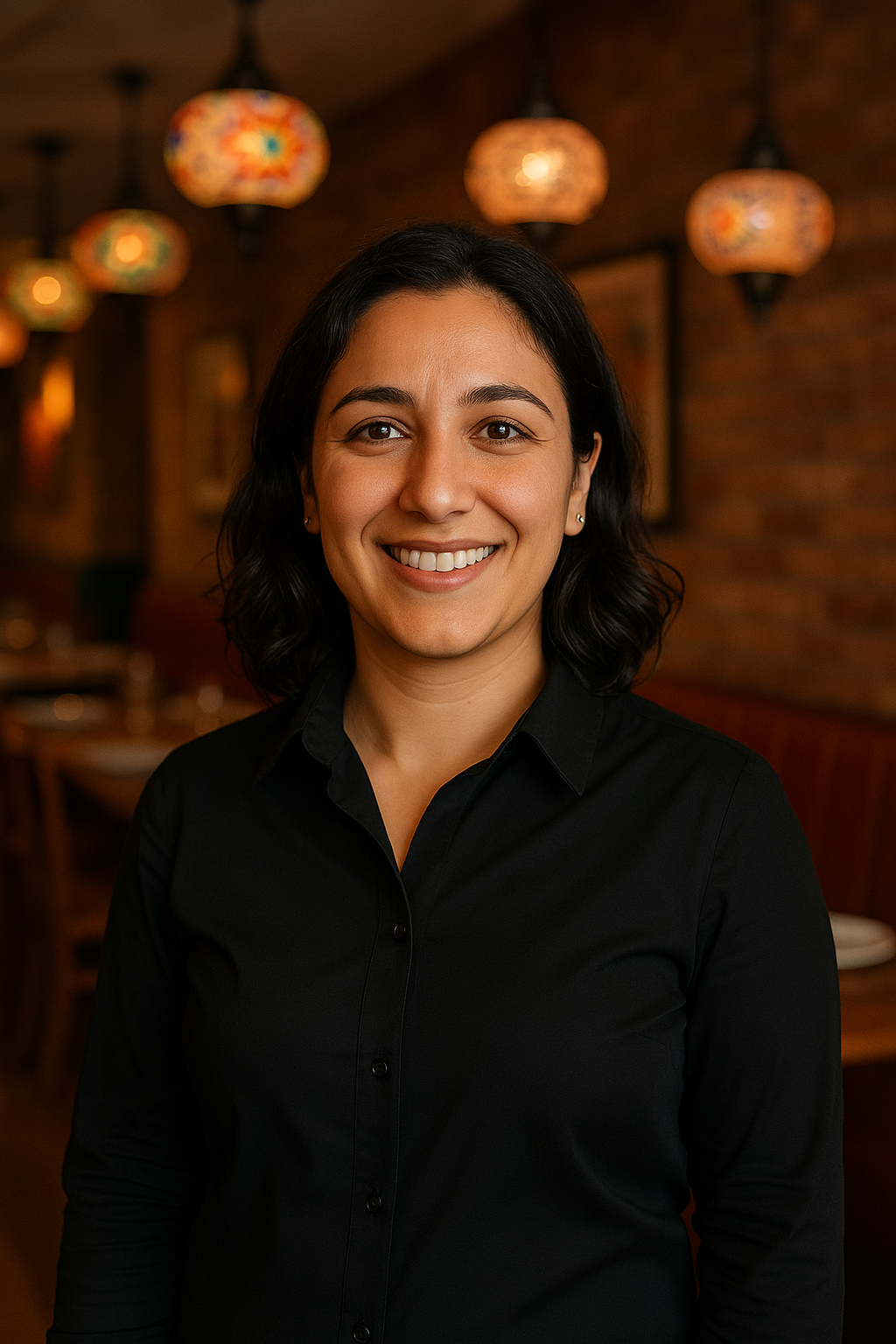
General Manager at Akarsu, a large, high-volume Turkish restaurant in North London
- Leyla manages a 100-table operation where up to 400 people might be seated at any given moment. Akarsu is busy, beloved, and chaotic by nature.
- Reservations currently go through a WordPress plugin on their site. Clunky frontend, zero integration, and all bookings hit the restaurant’s inbox.
- Email works when traffic is light. But with their volume, it creates daily issues such as missed reservation notes, double bookings etc.
- Leyla is tech-savvy. She’s comfortable exploring settings and workflows, but her team isn’t like that. Language barriers, low tech confidence. Also, typical for this restaurant type, high turnover.
- She’s researched other systems, but finds most to be over-engineered and overpriced or cheap and ugly, which reflects badly on the brand.
Leyla needs a system that feels premium to her guests and practical for her staff. The customer-facing UI should look sharp, clean, branded, modern.
Back-of-house, the interface must work well on tablets during service for a professional look, and support delegation without losing control. No bloat, no training manuals.
Goals & Principles
- No assembly required: A core goal from the beginning was that ORIN should never require training. Most independent shops don’t have the time, money, or staffing consistency to train people on new tools. The product had to make sense on first contact. It needed to feel straightforward and consistent, even if someone picked it up for the first time mid-shift.
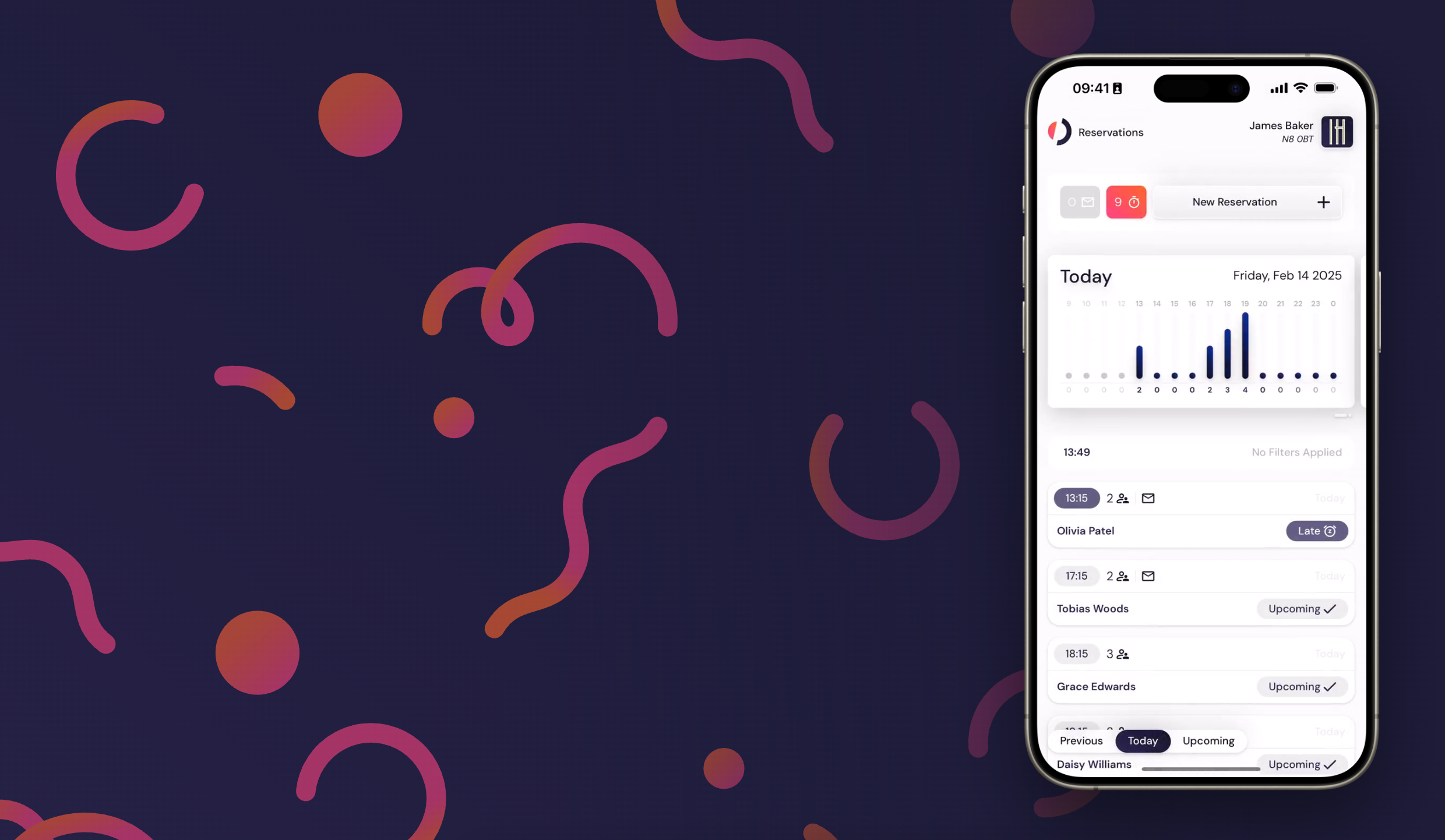
- Click & Done: We put most of our effort into getting the core workflows of managing reservations right. Most of our users are running busy floors with limited time and even less patience, so every key action needed to be as direct as possible. For example, confirming a reservation is just: Tap notification. Tap confirm. That’s it.
- All Flows must flow: On the customer side, the booking flow includes logic for opening hours, party size limits, credit card rules, and auto-accept conditions. Yet it presents all these in a clean, guided way. As long as a feature was discoverable, it didn’t need to be prominent, just easy to find again the next time someone needed it.
- And look good doing it: Visual design was also a priority. While it’s not a customer-facing tool in the traditional sense, it is sometimes visible to customers. For example, when a host checks a name on the tablet while greeting a guest. In hospitality, presentation matters. The UI needed to feel sharp, intentional, and professional — not like a back-office tool or bootstrap template.
We measured what we could. We tracked widget retention, time in-app, rage clicks, backtracking, and crash rates. Those numbers gave us confidence we were in a good place, but they weren’t our only signals. The strongest feedback came from calls with restaurant owners and direct observation of beta users handling real reservations. That mix shaped almost every decision going forward.
The Constraints
ORIN was built under real pressure. Time and resources were limited, and I had six months to design and build an MVP that could compete with mature products already on the market. Once we hired a back-end developer, the stakes got even higher. We were paying salaries out of pocket as three partners, and the project had to be stable and self-sustaining within nine months. This meant tradeoffs were constant.
Some key features had to be cut or delayed to hit our timeline.
Search was one of the more painful ones. It would’ve required significant back-end work and added friction to a tight deadline.
We also kept the initial table logic deliberately simple. While it didn’t suit every use case, we knew adding flexibility would’ve made the setup process more complex, which we couldn’t afford early on. Later on, I found a way to expand that logic without increasing the learning curve. But the implementation had to wait until after the final release.
Onboarding plan changed significantly too. We spent time building a self-guided flow, wire-framed, tested, produced hi-fi designs. Even commissioned hand-drawn animations for it. (We ended up using some of them in the marketing website.) Only to scrap it and move to an in-person onboarding process. It felt like a step backward at first, but ended up being the right call. Even gave us a path to future AI-assisted onboarding that could scale.
Key Design Problems
Making AI Replies Feel Natural, Not Gimmicky
Not every restaurant manager feels confident writing in English, even those who do often don’t have time to craft thoughtful replies to customer messages like “Can we sit outside?” or “Is it okay to bring a dog?” The AI reply feature was designed to help with exactly that. Staff could tap a button to generate a positive or negative response, or write something rough and have ORIN improve the tone. All from within the app, without needing to open an email client or step away from service.
The challenge was making that power feel quiet and optional. We couldn’t interrupt their flow, couldn’t make it feel like a gimmick, and couldn’t assume they’d trust a tool to speak for them.
On top of that, the feature needed to explain itself clearly, that tapping a button would generate a draft, not send anything yet, so that users would have a chance to review and edit before replying. We even had to account for tone. One tester told us the message sounded so polished that “the customer will expect us to wear black ties.” That led us to add settings for adjusting tone and message length.
The solution lives quietly inside the reply textbox.
- Before typing, two small buttons appear inside the field “Positive Reply” and “Negative Reply”. Visually subtle but clearly tied to the text area.
- If the user starts typing, those options are replaced by a single “Improve” button in the bottom-right corner.
This avoids accidental overwrites and keeps the experience focused. Early iterations that used an external popup-style interaction felt clunky and performative. Once we moved the interaction inline, testers immediately responded better. Usage has been strong ever since. It’s now one of our most used features.
Designing a Settings Page People Could Actually Use
The settings section in ORIN had to cover a lot: shop details, reservation logic, payment setup, notification preferences, table structure, user management, and more. Each section had its own logic and quirks. Most users had little interest in digging through any of it. Many were just trying to get up and running between services. The challenge wasn’t just UI, it was information architecture. I had to organise, label, and sequence these different sections in a way that made sense to people who didn’t want to be there in the first place.
The hardest piece was scheduling. Restaurants needed to set complex opening hours (e.g., open 9–2, closed for a break, then open again 5–11), along with days off, exceptions, and fallback rules. Drop-downs or native time inputs were either too slow or too fragile. Instead, I created a custom “flicker” input. A horizontal scroller that let users flick through time options like a compact carousel. It worked with both touch and mouse, felt fast, and avoided the visual noise of stacked drop-downs or form fields. Combined with logic that auto-adjusted the next available time range, it turned something tedious into a very natural sequence.
I based the overall structure on the iOS settings mental model, which meant most users instinctively knew how to navigate it.
I still made some tweaks based on feedback. Early versions of second-level menu items didn’t have descriptions, and users had trouble knowing where to go. I added labels, shadows, motion direction, and iconography to make the space feel tactile and understandable. The result was a settings panel that could support deeply specific configurations without ever feeling overwhelming. Something I’d rarely seen in other hospitality tools.
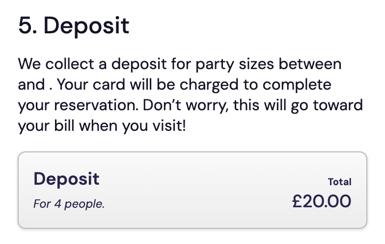
Hiding the Complexity in Customer Reservations
On the surface, ORIN’s reservation widget looks like a simple form. Underneath, it’s responding to a web of business logic: party size limits, time slot availability, credit card rules, reservation durations, auto-confirm settings, and more. Depending on what the user enters (date, time, or group size) the flow branches, adapts, or introduces new steps.
All of it needed to feel calm, trustworthy, and easy.
The biggest challenge was psychological, not technical. Even though we only asked for the information restaurants truly needed (name, contact, party size, reservation notes) it was still a lot. Presenting it all at once would’ve been overwhelming. So I broke the form into a step-by-step sequence and showed customers how many steps remained. That helped pace the experience.
To counter the friction of a multi-step form, I added a floating summary column that tracked and displayed the values they’d entered and made those values clickable, so they could jump directly back to earlier fields without having to step backwards one at a time. As each value was filled in, it animated into place in a dynamic and perky fashion, helping users feel like the form was reacting and advancing with them, rather than just asking for more.
Payment handling was another critical point. If a reservation required a deposit or no-show fee, that step only appeared when it became relevant. I made sure the UI never referenced payments if they didn’t apply. When they did, the copy was as plainspoken, and specific as possible. Per-person cost, why we needed card details, and what would happen next.
The final step showed a complete summary before the user submitted, including what they’d be charged (if anything), and how to contact the restaurant.
We tracked usage through heatmaps and session recordings. Abandonment during the form was minimal. Most exits happened either during slot selection (likely when users couldn’t find a suitable time) or at the payment step, as was expected. Overall average time spent on the form was just under a minute. Some restaurants even told us their customers had complimented how the widget felt. For a form that’s doing a lot of work under the hood, that’s the best kind of success.
Outcomes & Impact
Since launch, ORIN has processed over 100,000 reservations across 126 restaurants, all still in beta. The system is now gearing up to move beyond early access, with a stable product and strong adoption behind it. AI replies are used by around 40% of our restaurants, and those who use them tend to rely on them completely, sending almost every single customer reply through the tool. Payment-based reservations (deposits and no-show fees) are enabled in about 2% of bookings. This is an intentionally small number, that reflects how restaurants treat payments. A necessary protection. Not something they want to impose unless absolutely needed.
The feedback has been personal, unfiltered, and deeply satisfying. A few restaurants have reported an immediate spike in bookings. Likely because their old tools weren’t working properly and were silently losing them business. Others have commented on how much more professional they now look to customers. One user told my partner on a call:
“I thought you were selling me a gimmick, but man, this is a life saver. I’ll kiss your hands next time I see you.”
We’ve also had multiple restaurants pass along compliments they’ve received from their customers about how smooth and polished the booking experience feels. (Imagine, as a restaurant manager, being complimented on your reservation widget.)
Different kinds of users are benefiting in different ways:
- Those switching from enterprise tools are saving money and time.
- Those coming from DIY setups such as WordPress plugins or Wix widgets, are getting proper tooling and team-level visibility.
- And for those who had no system at all, ORIN has been a genuine unlock: mobile-first, easy to use, and actually built for how small shops operate. One user compared it to Instagram, because it just worked on their phone and felt natural to check throughout the day.
The biggest wins haven’t just been technical. They’ve been emotional. Less stress. Fewer phone calls. Fewer no-shows. More confidence that reservations are under control. And all of it in a system that’s faster, cleaner, and far more accessible than anything they’d used before.
Final Thoughts
What I’m most proud of isn’t a single screen or feature. It’s the polish in all the small things. The timing of an animation, the way a background shifts subtly, the way the interface reacts just enough. I still open the app and enjoy how it feels to use. If I had to pick a specific feature, I’d default to my partner’s favourite, the AI replies. A complex and nuanced interaction that ended up feeling seamless.
If I were starting over, I’d rethink table management. It works, and few customers complain, but every time I sit down at a restaurant, I find myself picturing edge cases that don’t quite fit the model, even with the expanded logic. Would definitely worth a revisit with fresh eyes.
The biggest shift for me as a designer came from the research phase. I used to see early research as something to get through quickly. Learn just enough, build and test. But spending three months on research before writing a line of code probably saved us six months of rework. It changed how I think about up-front insight. Building ORIN, with tight time constraints and no room for fluff, was the most intense design and discipline challenge I’ve taken on. It left a mark in the best way.
Now that the product is generating revenue, I’ve brought on a full-time junior designer, a freelance senior, and a developer. They’re improving ORIN and spinning up a new product and a brand from scratch, this time with me in more of a mentoring role. After building the foundations myself, it’s been a smooth shift into guiding others and scaling the work beyond my own hands.