
Veolia Customer Hub 2.0 is the new, single touch-point where Veolia’s B2B customers handle every waste-management job. Rescheduling collections, downloading compliance docs, ordering bin bags, or raising a support ticket. All without picking up the phone. What once felt like a maze of mismatched screens is now two or three calm, consistent taps.
As Lead Product Designer, I rebuilt the experience hands-on while guiding a UX and a UI designer, partnering with four engineers, and coordinating daily with an internal Product Owner and later a QA analyst.
Why the overhaul? The legacy hub was a decade-old a decade-old Frankenstein of bolted-on features, zero consistency, and utterly unusable on mobile. The broken support flow drove customers back to phone lines, spiking costs and tanking NPS. Leadership declared “start over” and charged our contractor squad with achieving full feature parity.
The result is a scalable, mobile-first platform tightly integrated with Veolia’s internal services, Salesforce, and Power BI. Ready to restore trust and slash support calls from day one!
Discovery
With external customer interviews blocked by legal, we pivoted to the next-best source: Veolia’s 40-person customer support team. Every Tuesday during our four-week discovery sprint, the UX designer and I interviewed 6–10 agents—covering small businesses, enterprises, and councils at various levels of seniority. Friday afternoons were reserved for workshops where we mapped out workflows in Miro, validated early wireframes, and ran group sessions to tease out systemic issues and pain points.
We also ran two stakeholder interview rounds (at the start and midpoint), and closed the phase with a curated playback deck. We tried to get session-tracking approved for the live hub, but corporate IT blocked it. We had to work entirely from interviews, support logs, and pattern recognition.
Internal Alignment
Our Product Owner was the real reason this project moved forward. He wasn’t a high level VP or anything, but had earned enough trust inside the org to assemble a team of contractors and secure a budget. This was a fast-moving, make-or-break initiative, and everyone involved knew it. If we didn’t display value quickly, project would die quietly.
Because of this nature of the project, it was planned for a phased rollout, meant to gradually replace old features with new ones over a year, initially appeared sensible to stakeholders as a way to keep internal hype alive throughout the entire timeline.
However, from a UX perspective, mixing old and new interfaces would confuse users and create friction. It would mean introducing users repeatedly to partial updates, making the new design appear unnecessarily complex and fragmented, muddying the value of the entire redesign.
I pleaded for, and secured a single, clean cut-over to the new system by taking responsibility into handling the internal hype myself.
Early on, one VP argued that the redesign should optimise for enterprise customers, since they brought in the most revenue. But the interviews told a different story. Enterprise users used the hub regularly and had learned to live with its quirks. Support calls came overwhelmingly from smaller businesses and council users. People who used the platform occasionally and couldn’t make sense of it.
I reframed the project’s success criteria as visually modernising the Customer Hub for enterprise users, while cutting support calls from small and mid-size customers. That framing struck the right balance: nothing would regress for high-value accounts, but the redesign would focus on the parts of the experience that were actually causing operational drag. Stakeholders aligned quickly once they saw that both goals could be achieved without compromise.
Major pain points
- “Open a ticket” logic was confusing and impersonal. Most customers ignored it and just called support, where agents filled out the same form.
- The schedule and documents pages were unclear and unhelpful. Users called support just to interpret those pages.
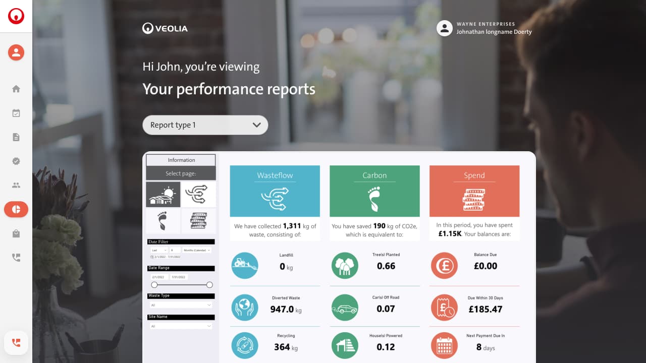
- Dashboard was filled with meaningless charts that didn’t convey any useful information. More importantly, dashboard wasn’t doing what it was supposed to do, be a “board” to “dash” to specific user flows.
- Missed direct debits weren’t flagged properly. Paying a one-off invoice was a multi-step mess.
- There was a clear need for a notification structure. But the current version of the hub did not support it.
Key outcomes
- Every feature must work just as well on mobile. No compromises, no fallback views.
- Each page must declare its purpose immediately. The user should never need to scroll or guess what a screen is for.
- The dashboard must guide users to the key flows they came for.
- Support must be redesigned entirely to feel human.
- Notifications matter. If a collection is missed, a payment fails, or a document is added, the user should know right away.
- The product must feel professional, but not cold. It should reflect the user’s business context, with just enough personality to feel alive.
- Power features should be discoverable but never in the way. First-timers get clarity; power users get stuff done fast.
Goals & Principles
Business Goals
Cutting support calls was critical, but it wasn’t the only business objective. Veolia also wanted a customer hub they could confidently showcase when courting new enterprise clients. The existing hub was outdated, visually unappealing, and not something you could parade in sales meetings.
The redesign needed to feel obviously modern, fully mobile-friendly, cloud-based, polished enough for large-enterprise prospects, yet intuitive enough to reduce ongoing support costs.
Design Goals
Internally, we committed to a few clear UX objectives from the start.
- Increasing user autonomy was non-negotiable: every flow had to be obvious enough for first-time users to confidently complete tasks without calling for help.
- Visual polish mattered too, but it took a backseat to clarity and ease of use.
- Beyond usability, we regularly checked ourselves against the goal of making the system feel more personal. Less like an intimidating corporate monolith, and more like a professional tool people wouldn’t dread using.
To make these goals actionable, we set a strict UX target:
Each page must declare its purpose immediately. Users should never have to scroll up and down, or guess why a screen exists.
Core Principles
We secured explicit buy-in from all stakeholders (with close guidance from Veolia’s Customer Support director) on these design principles:
- Every feature is mobile-first. No compromises, no stripped-down fallback views.
- Purpose-driven screens. Immediate clarity about each page’s main job.
- Dashboard as a guide. Users must quickly jump into their key tasks. No meaningless charts.
- Human-first support. Redesign the help experience completely, removing impersonal “ticket” jargon.
- Instant notifications. Users must know right away about missed pickups, failed payments, or new documents.
- Professional, not cold. The interface should respect users’ business contexts, with just enough personality to feel alive.
- Power without clutter. First-time users should feel clarity immediately; power users can easily unlock advanced features without visual overload.
Principles into Practice
Adhering strictly to mobile-first meant making tough calls, such as completely abandoning the calendar-based schedule view, which at one point, we realised could never work well on smaller screens. Instead, we adopted a simpler layout that immediately clarified the pickup schedule status. This initially limited functionality for our power users, but later iterations solved for both groups.
The principle that evolved most during the design process was balancing simplicity and power-user friendliness. My initial approach, favouring extreme simplicity, risked making the system look superficially “too simple,” potentially underwhelming executive-level buyers during enterprise sales pitches. We iterated carefully to maintain clarity without losing credibility or depth, eventually finding a sweet spot that balanced both usability and professional polish.
Measurement
Our primary success metric remained consistent from day one: weekly support-call volume per 1,000 active accounts. After launch, we complemented this core metric by tracking user sessions, task completion times, heatmaps, and session recordings to fine-tune the UX further.
Constraints
This project was as much about navigating the organisation as it was about designing the product. Every step forward meant balancing technical realities, shifting resourcing, bureaucratic blockers, and political landmines—often simultaneously.
Technical constraints
We initially envisioned a more dynamic reporting page, particularly useful for enterprise users who needed quick access to structured service and invoice data. That idea died fast. Reports were owned by Power BI, and while we were happy to collaborate with the responsible team, the changes we needed would’ve required months of work on their end, and that simply wasn’t going to happen within our timeline. The final solution was embedding the existing report in an iframe. Not mobile-friendly, visually inconsistent, and completely out of our hands.
The support section hit similar walls. Our design called for a contextual, chat-like help flow that gathered key data automatically and handed it off to a human agent. But Salesforce’s rigid structure made this impossible. We adjusted the flow to feel conversational and helpful, even though it still created a support ticket under the hood.
 We also learned early that our infrastructure couldn’t handle real-time updates. This killed any plans for live alerts like “your truck is en route” or “collection was missed.” Instead, we designed for the appearance of immediacy, knowing the data was only refreshed once daily, overnight.
Organisational constraints
Veolia is a century-old company with deep structure and complex internal processes. It wasn’t built for rapid product development, and it showed. We couldn’t get legal approval for even the most basic UX tools like screen recorders or session trackers.
Keeping the right people informed meant constant translation: quick-fire slide decks, curated stakeholder sessions, and understanding how to speak to each group’s priorities.
Each external partner team we worked with, Salesforce, Power BI, internal branding, had its own way of doing things. I spent as more time negotiating alignment than I did designing screens.
At one point, I had to introduce myself and the project to the internal brand team, since their existing brand guidelines weren’t built for digital. I created a simple digital brand guideline. Just fonts, colour rules, and basic layout logic based on their existing identity. Presented it alongside early UI work to show how we were applying it in practice. I made sure they could give sign-off without slowing us down. Fortunately, the team was receptive, and we got the approvals we needed to move forward.
I also quickly learned that every key decision required senior approval. I secured early, explicit endorsement from the highest-level stakeholder I could get in front of, and leaned on that support when needed.
Resourcing & timeline
When I pushed for a single, clean release (instead of a phased rollout), our original 12-month runway collapsed into a six-month deadline for a feature-complete beta. I had already cleared this with engineering before making the ask, and thanks to careful scoping (and my dev background), we stayed on track.
Midway through the project, a contractor payment freeze hit the entire team. Two developers left as a result. Our UX designer also had to switch to part-time, understandably, he needed to prioritise faster-paying freelance work. I stepped in to hire and onboard new developers, and absorbed UX responsibilities myself. There was no handover needed on the design side; we’d worked side-by-side from the beginning. As for the new developers, I worked closely with the new hires to bring them up to speed and rebuild the team’s rhythm.
We flagged the potential delay upward, communicating that the timeline might slip by a month. Even then, we shipped the full beta on time.
Design Problems
1. Fixing a support flow nobody trusted
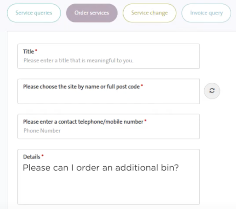
The old support flow so clunky, it actively discouraged users from asking for help. The form was long, everchanging, impersonal, and riddled with dropdowns. Most critically, it ended in a concept users didn’t understand or trust: a “ticket.”
People don’t know what a ticket is. And if they do, they think it’s going to vanish into a black hole.
The original flow made users fill in everything manually: name, request type, company, location, and additional details depending on the issue. It ended with a submit button that generated a support ticket. No confirmation, no human, no clear outcome. Unsurprisingly, most users skipped it and just picked up the phone.
We reimagined the experience entirely. Instead of presenting a form, we let users start by selecting (or searching) what their issue was related to. This triggered a new kind of interface: a fake chat window that felt human, apologetic, and responsive, without being staffed in real-time.
Since we already knew the issue type, we could tailor the opening message:
“We’re very sorry to hear we’ve missed a collection. We make every effort to keep to our agreed schedule.”
From there, we turned what used to be dropdowns into pre-written chat bubbles. If a user managed multiple locations, we’d ask them which one they were contacting us about with answers styled as clickable chat responses. Additional details were gathered the same way, one small conversational step at a time.
At the end, instead of forcing one resolution path, we let the user choose:
- Chat live now
- Call me back
- Create a support ticket
- Nothing for now
The intended plan… and the compromise
Originally, we wanted the experience to be seamless. User submits their issue, and we instantly escalate to a live support agent, all within the same window. We designed it that way from the beginning, and the flow was built to collect all relevant context upfront.
But Salesforce had hard limitations: live chat had to happen in a separate window, and data couldn’t be passed cleanly across sessions. We couldn’t preload the conversation or keep the user in the same interface.
So we faked it.
We restyled the real chat window to look exactly like our fake one, then closed the first and opened the second when users chose “Chat live now.” With some clever scripting, we passed their context forward and simulated them hitting “Enter” so the first message would appear instantly, as if the conversation was already underway.
It wasn’t elegant. But it worked.
The impact
We tested the new support flow in Figma prototypes, first internally, then with customers once we got clearance. It was an instant hit. Internally, it was dubbed “smart chat”, and the sales team immediately latched onto it as a selling point. More importantly, support agents were relieved to see the old form die and hopeful that this would finally reduce call volume.
It launched alongside the rest of the beta and delivered. Support calls dropped fast, and the ones that remained were mostly about edge cases outside the tool’s scope.
The system didn’t just replace the old support form. It reframed the idea of support entirely, from something transactional and opaque to something conversational and (almost) human.
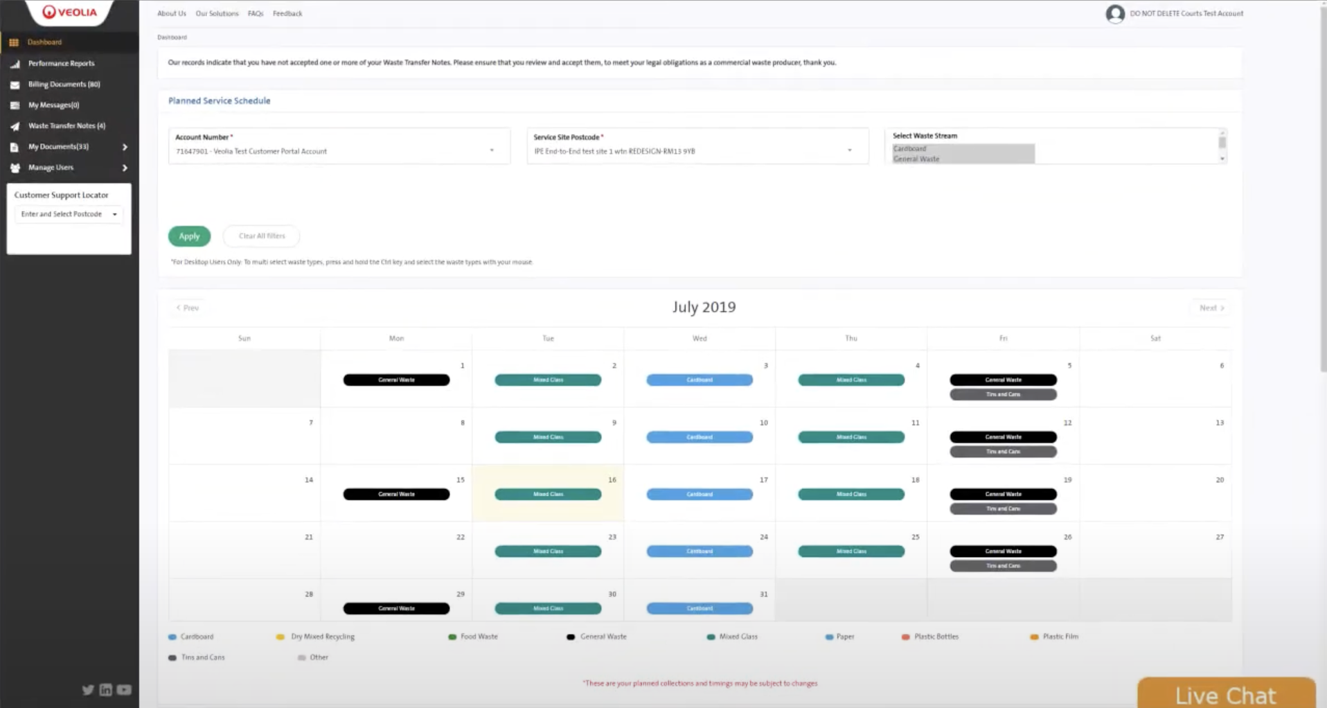
2. Best way to show a calendar on mobile is, not showing a calendar.
The original schedule page looked like a calendar, because it was one. A full month view, filled with coloured service blocks and timestamp labels. It was cluttered, hard to scan, and nearly unusable on mobile. Still, it made intuitive sense. Everyone knows how to read a calendar, right?
That’s what we thought too.
From the beginning, both I and the UX designer were convinced the calendar view was the way forward. We spent days trying to make it work. Colour-coded legends, tap-and-hold interactions, expanding popups to show full context. We tried everything to save it. And it almost worked. Our latest version had a clean grid, service status icons, and a layer that revealed more detail when tapped. It was dense, but functional. Not perfect on mobile, but we were proud of it.
Then the UI designer spoke up.
She hated it. And at first, I remember thinking: “Come on, we’ve already sunk so much time into this.”
But I gave her space to try something different. And what she came back with completely reframed the problem.
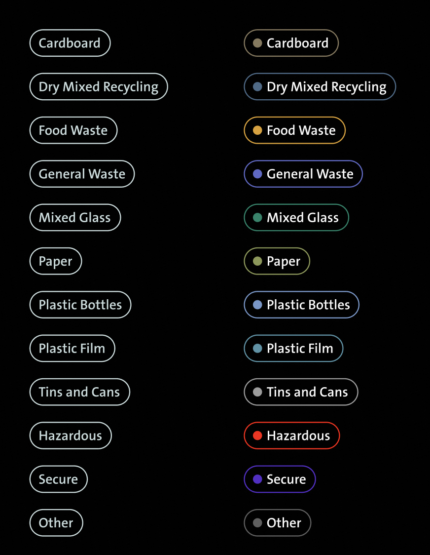
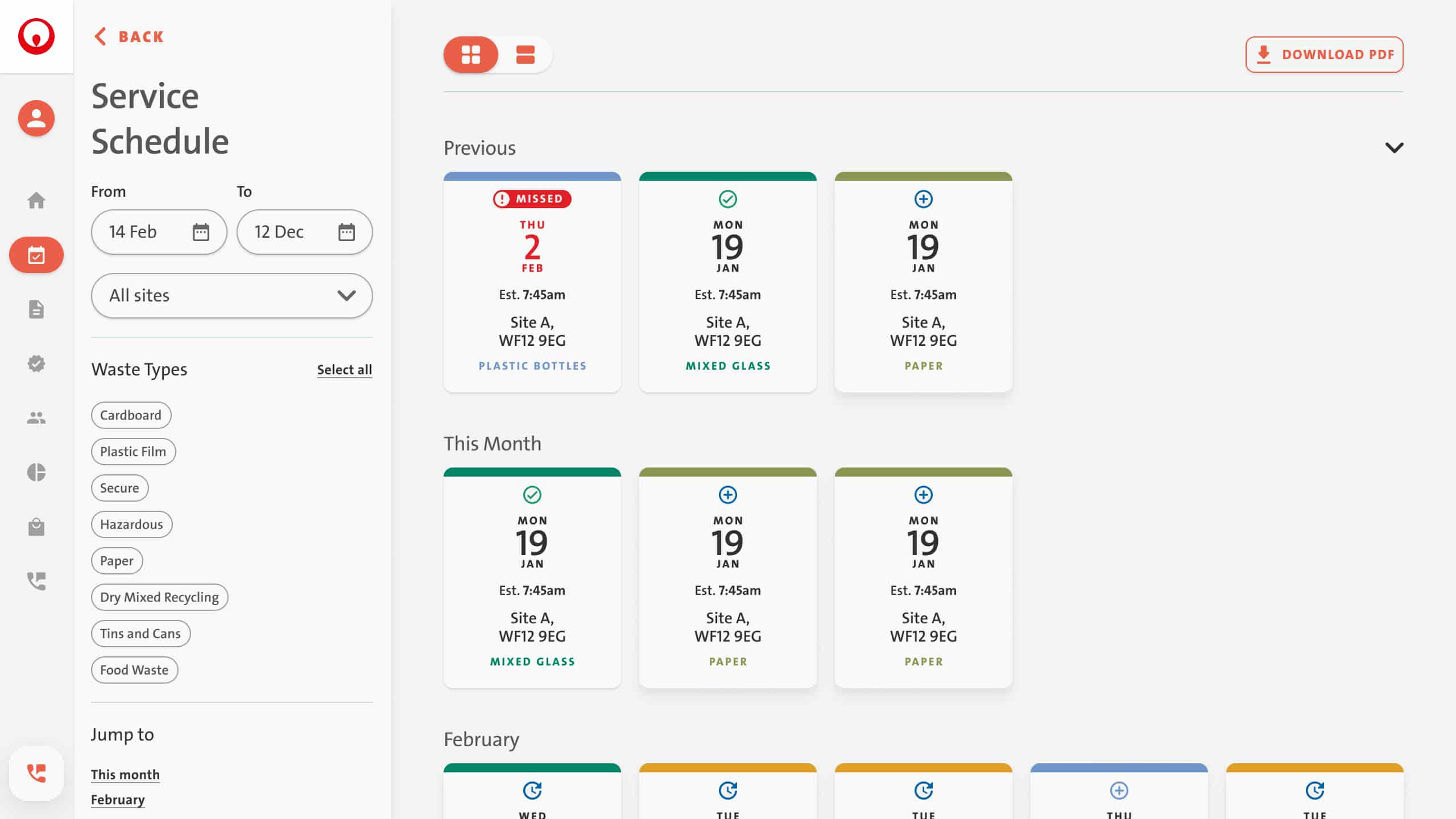
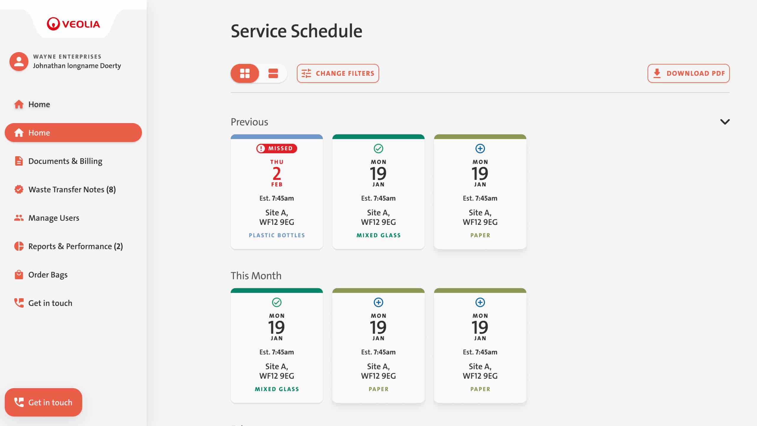
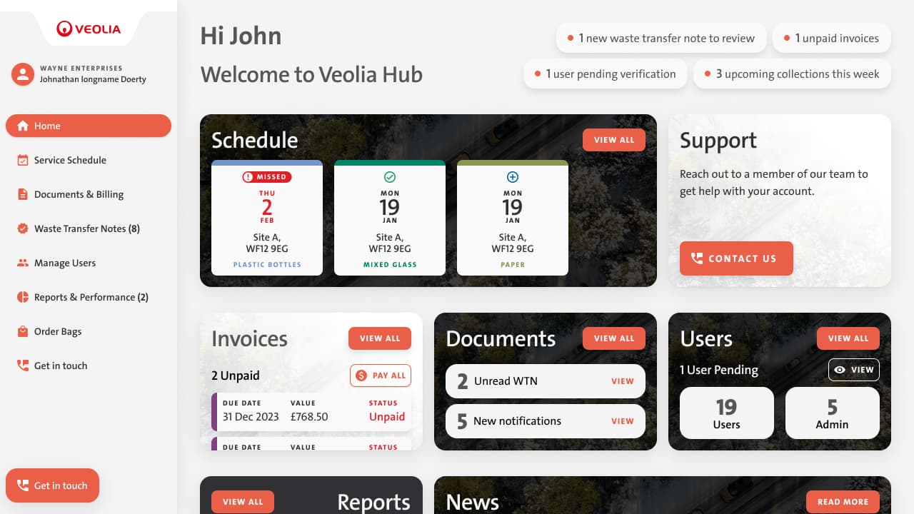
She dropped the calendar entirely and replaced it with a scrollable list of card stacks, grouped by month and ordered chronologically. Each card showed the essential details:
- Service date (high contrast, top left)
- Status (missed, upcoming, completed)
- Time, location, and service type (colour-coded for fast scanning)
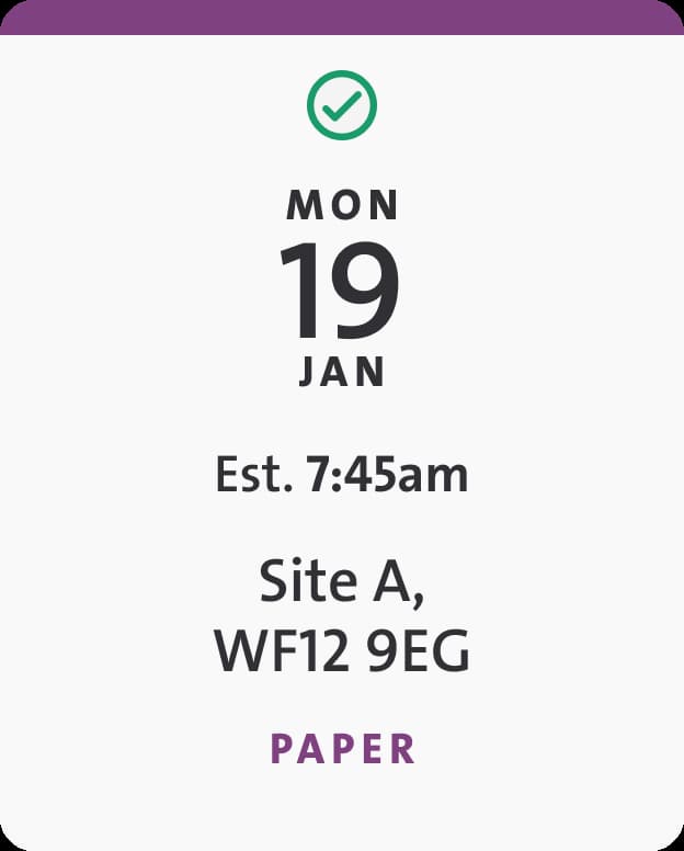
Instead of tapping into cells and digging through interactions, everything was there at a glance. It adapted perfectly to different screen sizes and, unexpectedly, it solved a major issue we hadn’t cracked: enterprise users could now view services across multiple locations in one continuous view.
You could also toggle between card view and a condensed “line-item” layout. Whichever worked better for how you processed info. The system would remember your choice for next time.
What we wanted, but couldn’t do
In an ideal world, the page would’ve been dynamic. If a truck missed a collection, the page would update instantly. If service was delayed, the shop would know before wheeling out their bins. And on the backend, that kind of data did exist, drivers had just been issued tablets to report exactly these events.
But it was all flowing into a third-party system we had no access to. No APIs no access. Not even a meeting to talk about it.
We could only work with the data after trucks returned to the depot and filed their end-of-day reports. So we made the UI feel as reactive as possible, even if the data lagged by several hours.
The impact
Internally, we braced for resistance. This wasn’t a calendar anymore, and we assumed people would push back. But it turned out we were the ones holding on to that idea. Nobody missed the calendar at all. The new format was faster, clearer, and easier to trust.
Once live, support calls about schedules dropped immediately. Only a handful of users continued to call, and those cases were less about the design and more about general digital literacy.
Looking back, it’s one of the moments I’m more proud of. We could let go of what we’d built, and let the better idea win.
3. Trick is knowing when to show it
This one was about perception.
Throughout the design process, we worked hard to keep each page focused. One job, done well, with minimal visual noise. On most screens, filtering tools and secondary controls were hidden under buttons or modals. The main nav sat open on the left-hand side, clearly labeled, but not overwhelming. It was simple, clear, and worked equally well on mobile and desktop.
But as we approached a key milestone meeting with the VP who’d originally pushed for an enterprise-first angle, I had a gut-check moment. I was clicking through the interface, imagining what he’d say. And I could hear it in my head:
“This looks too simple.”
He wouldn’t be wrong either. With the left nav open and most filters hidden behind discreet buttons, the product could look sparse, especially to someone expecting “powerful enterprise tooling.”
So I made a tactical call.
The trade-off
We already had filtering panels, a well-designed, context-aware UI that users only saw when they needed it. The challenge was: how do we show complexity without making people wade through it?
The inspiration came from our UX designer, who, like me, had a background in ecommerce. With experience designing product listing pages, he was used to placing filters in a persistent sidebar. That mental model clicked for this context too: we had filters and secondary information scattered across the product, and a sidebar could serve as a clean, familiar way to surface that complexity without overwhelming the main content. The only issue: we didn’t want to introduce yet another layout.
So we flipped it.
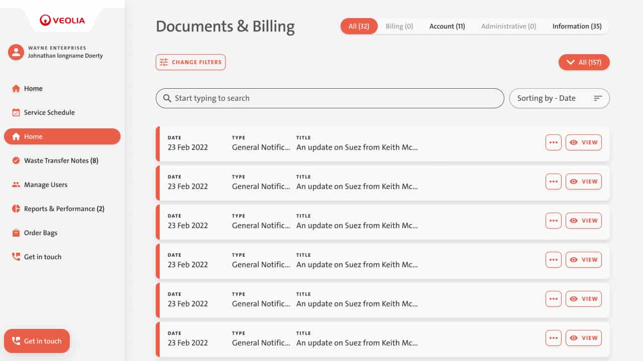
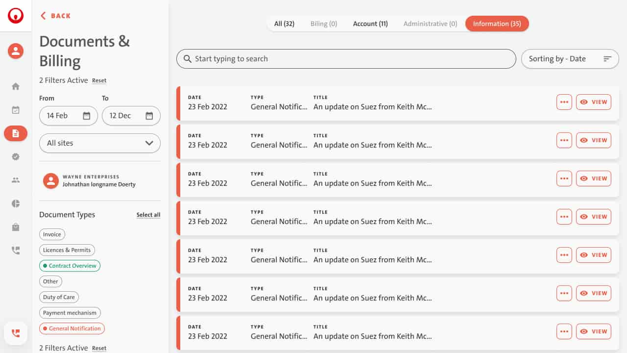
We collapsed the left-hand navigation into a slim bar. Just icons, no labels, on all pages except Dashboard and error states. Our user research backed this move: people almost never used the nav to jump between unrelated pages mid-session. They came in, did one thing, and left. Once someone had scanned the full nav on the dashboard, it wasn’t helping much.
That freed up the left edge of the screen.
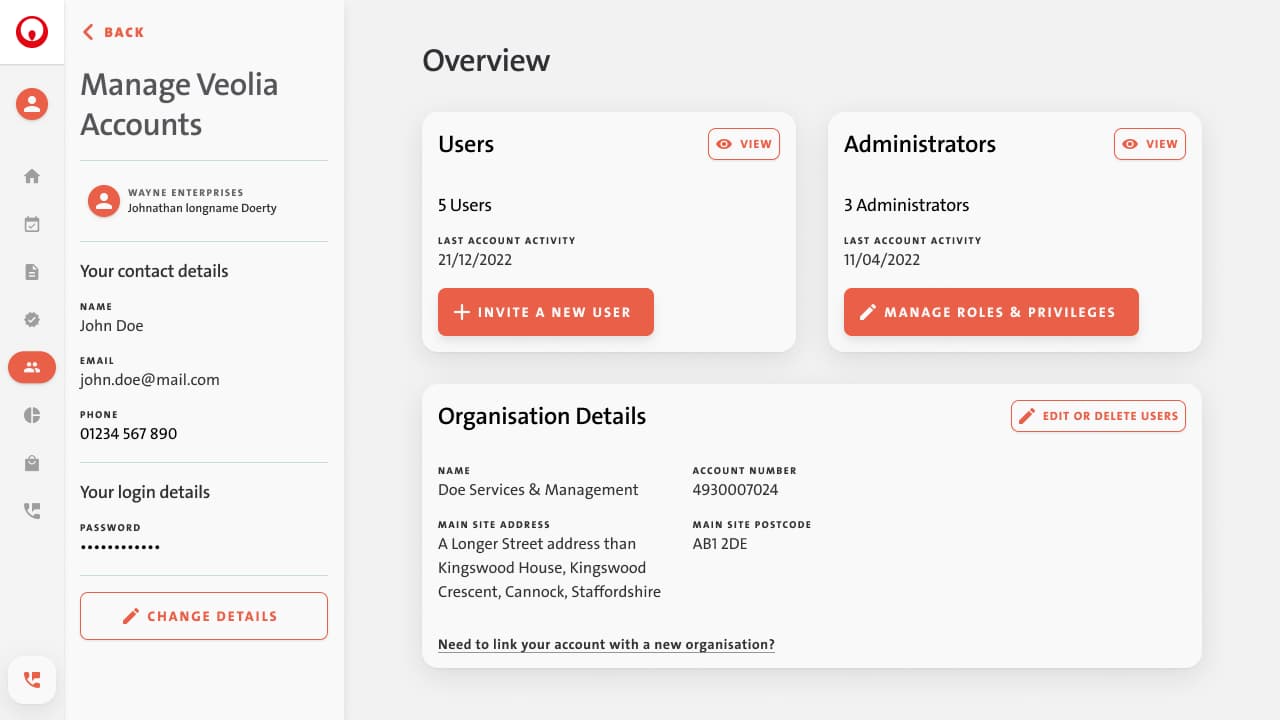
We replaced it with a dedicated context panel that is visually separate, always present, and page-aware. It started with the page name and a back button, then slotted in whatever controls were relevant for that section:
- Filters on the schedule and billing pages
- User details and roles on the accounts page
- Preview tools or secondary actions elsewhere
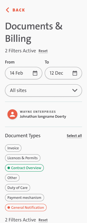
Because we’d been working strictly with auto-layouts and components, the integration was fast. We essentially ported our existing filter components into this new layout, with only minimal adjustments.
The one exception was the support page. That flow had to feel light and dynamic, so we kept both the navigation and the context panel closed by default.
The impact
This wasn’t a data-driven decision. We weren’t able to A/B test it. But user testing and session recordings showed the new layout didn’t get in anyone’s way. Most users ignored the panel entirely (which was the goal). It was there for power users or enterprise buyers, and invisible for everyone else.
As for the stakeholder, he never even noticed the trade-off. Updated screens during our milestone review was the only thing he’d seen. He was happy, we didn’t have to explain the compromise, and the project stayed on track. Which, honestly, was the best possible outcome.
Outcomes & Impact
Quantitative results
In the first month of beta testing, support call volume dropped by 70%. That includes the expected confusion from users adjusting to an entirely new interface, so the real gain was likely even higher. We didn’t have data from the old system to compare against, but average task completion time landed around four minutes. Solid performance considering the system’s complexity and breadth.
Qualitative feedback
Internally, feedback was overwhelmingly positive. The support team was relieved to have a tool that reflected how they actually worked. Sales started using the new platform in pitches immediately. The product owner later told us it became “the crown jewel of all our sales materials.”
Stakeholders didn’t say much directly. Which, in a corporate context, usually means you did something right. The product owner passed along that they were happy and already using the redesign as a central proof point in sales conversations.
Business outcomes
The release was scoped as a beta for a controlled user group, but from what I’ve heard, it’s since rolled out more broadly. I can’t verify that firsthand since testing it would require an active commercial Veolia account and an actual waste management contract. But from internal reports, it’s now become a selling point, not a liability.
Team transition
After the beta launched, we entered a strange lull. The company was happy. The budget was there. But the product was stable, and there wasn’t much left to fix or design, at least not yet. We all knew the rule: don’t fix anything until you’re sure it’s broken. With limited data from a small test group, we decided to wait.
That left most of the design team in limbo. We’d done our jobs almost too well. I lined up a full-time role elsewhere and handed the project off to the UI designer and (part-time) UX designer. Both more than capable of carrying it forward.
A few months later, the product owner got promoted. Eventually, he used the role as a springboard into a VP position at a major media company in Australia.
Final Thoughts
This project was a constant negotiation, between clarity and politics, simplicity and optics, and struggle for actually getting work done inside a slow-moving organisation.
Veolia is a deeply established, structurally rigid company, and stepping into that world as an external lead meant learning the system quickly. The internal dynamics weren’t dramatic, but they were real, territory, approval chains, quiet power struggles. It would’ve been easy to get stuck in that machinery.
What I’m most proud of is that we didn’t. We kept quick on our feet, navigated the constraints, and built something that’s not only being used as a reason to choose Veolia, but making life easier for people that do.
I knew it was not an easy thing to deliver inside an environment like this, but the reality still managed to teach me a few things I hadn’t planned for.
If I were starting over, I’d show less humility up front. I led with curiosity and openness (because that’s how I work) but in a company like this, that was sometimes misread. I later realised that what some stakeholders needed to see wasn’t potential, it was certainty. If I’d recognised that sooner, I probably could’ve pushed even harder, earlier.